Stolen Work

First you need to be clear what exactly I mean by stolen. Artists copy all the time. It was and is common for an artist to sit in a museum and copy the works of other artists. This is not forgery it is how artists learn. It is possible that another artist can inadvertently copy something another artist has just created.

A forgery is a bit different since there is no illusion about inadvertent copying. Many successful forgers don’t copy existing works from other artists; they make up new works that the intended artist might have done. The problem then is replicating the artists style. Forgery happens when the original artists name is put on the artwork with the intent of selling it for more money. This does not mean that a forger will not copy an existing work, it’s just a matter of what is easiest, what the forger is capable of and what the forger thinks is less likely to get him or her imprisoned.

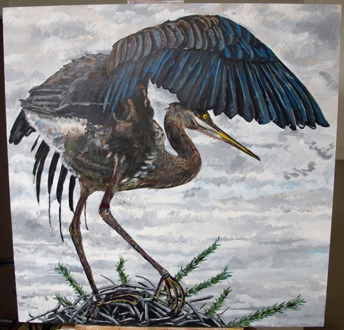
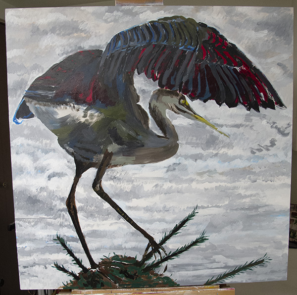
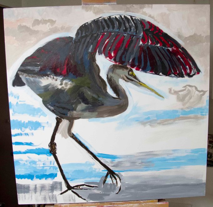
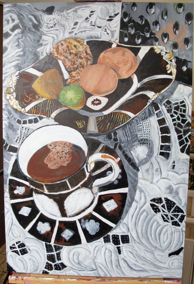
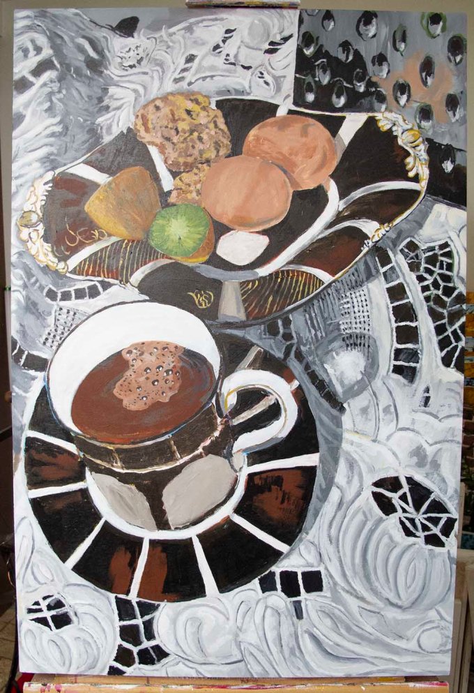
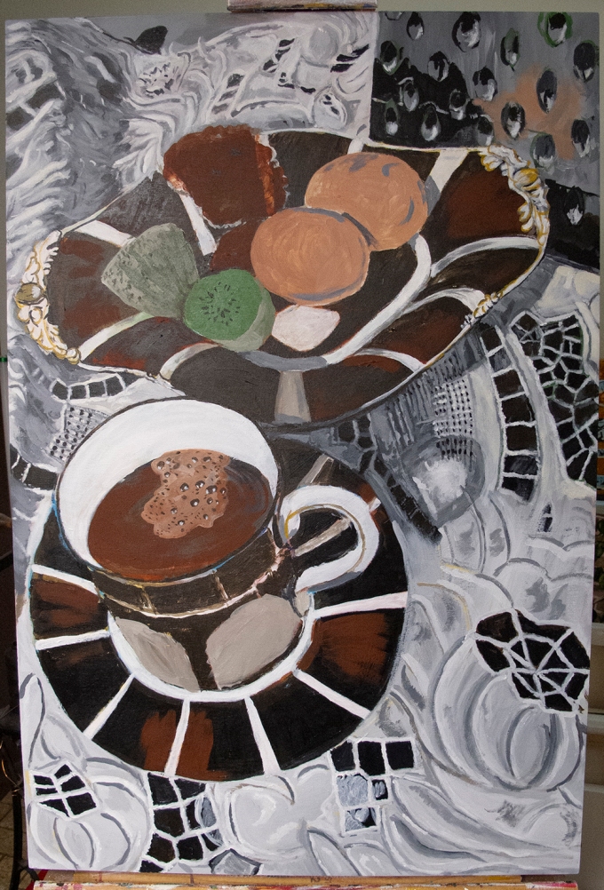
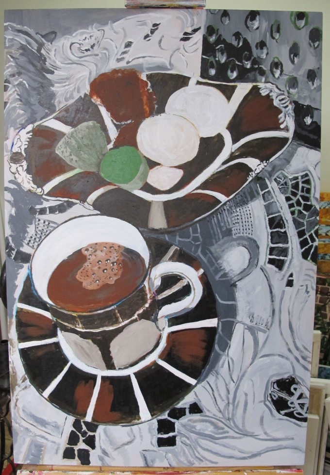
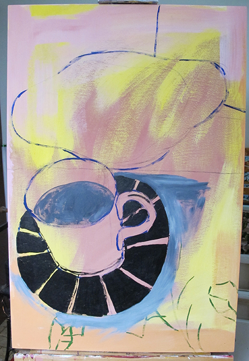
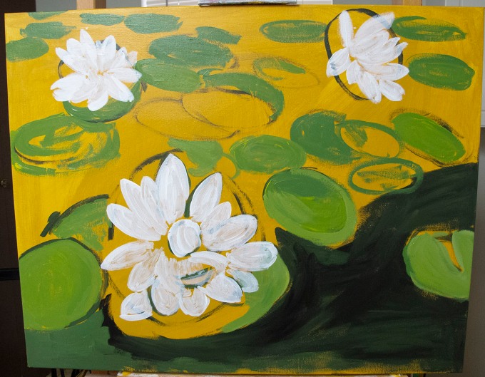
Now with cameras, and Photoshop, so widespread, it is becoming difficult to tell if any part of an image is copied or not. I’ve seen collages that are clearly made up of other works by different artists but the new work can still stand out as better than the original. I make it a point to paint from reality (or original photographs) I try very hard not to copy anything from a drawing or painting. I’m convinced that a couple of my paintings are copies, at least in part, but I just can’t remember the earlier work or where I saw it.

It’s one thing if an artwork is actually stolen, since there is a physical thing but it’s another if it’s an idea that has been copied. It’s easier to prove that a physical thing was taken but its quite another if you are talking about intellectual property theft. I think that if you put another artists signature on a work with the intent of getting more money then that is clearly forgery. It gets murkier with older paintings because at one time artists were not in the habit of signing their work and in some cultures, there is no tradition of signing art. In some cultures, even the idea of a signature is foreign and elusive.

If the intent is simply money then I would advise don’t do it. However, if you simply want to make art then do it in your own way and the copy accusers be damned.

Heron Feathers

So today I’m working on a painting of a heron and as I start working on the wing feathers, I realise that I don’t know where to put the paint I have on my brush! In fact, my whole interpretation of the feathers on the heron’s wing has changed and I no longer think what I am doing works.

This has happened to me before and I’m starting to think it’s pretty common for me and I wonder if this happens to other artists? My theory is that I don’t just go back to the photograph (most of my painting is done from photographs) I envision a three-dimensional construct, in my head, of what I am seeing and I use that construct to determine where the paint goes. With the Heron I lose the exact feather and with a flower I lose which petal I’m working on. The advantage is that it forces me to re-evaluate style and colours along with layout, so I’m constantly rebuilding the reality in my head. I like to think this results in a better painting.

This has been happening to me for as long as I can remember. So, to put a positive spin on it; it may have something to do with what I call the reality illusion. Every time I lose my place I have to re-evaluate and that allows me to notice the reality illusion. Of course, I might just be confused and need to find where I was working. Hope it works.

Through A Window

This morning I’m looking out of my kitchen window and there is the most painterly sky. Not many clouds but beautifully formed with a touch of morning colour on them. I’m wondering what makes this mornings clouds so different? I see this scene almost every morning so there isn’t anything different about the sky or the neighbour’s back yard; so, what is it?

After a little thought and a trip, out to my deck wondering if it is the window frame that makes the sky look so beautiful, I decide finally that it is the contrast that makes the sky so painterly. I’m looking at the sky through a screen and the effect is a slightly pixelated quality that actually resembles a photo of a canvas but I don’t think this is it, so, I finally end up with contrast. The screen reduces contrast to a lower level, that might be equivalent to paint on canvas hence the painterly sky.

My take away from this is that most scenes that I am trying to paint have high contrast. In fact, I think that high contrast is one of the traits I look for in scenes to paint; this may come from my time as a photographer, where often contrast is king. It’s curious that even though I’m looking for high contrast, the reality illusion may depend on low contrast, or contrast that is confined to specific levels. I say this because I’ve sometimes been surprised by the sudden appearance of a semblance of reality when I’ve been painting a background, or some other innocuous part of a scene. I’m looking at a high contrast image through the window but the screen artificially reduces the contrast, so it’s similar to paint on canvas.

At present I am working on a Still Life that has a white doily as a background, and that doily is very low contrast. The reality illusion has only presented itself as I reduced the contrast in the doily. Often, I am very surprised when the reality illusion springs to life when I’m working on a very low contrast background. I can’t say this is definitive because sometimes the illusion waits until the last moment to present itself, when I’m applying very light or dark colours. So, I can’t say that the reality illusion is dependent on either high or low contrast, it seems to appear when the colours match what I am seeing.

I’ve been thinking for a while now that scenes that I paint have far more contrast than is useful or even possible to render with paint.

Pure Colour

I don’t believe there is such a thing.

I think of colour as light, so black would be the complete absence of it. Light is simply various frequencies of the electromagnetic spectrum and we can’t see much of that spectrum. When artists talk about ‘pure colour’ they are usually talking about a specific pigment and many natural pigments can reflect a very narrow band or bands of the electromagnetic spectrum.

Don’t get confused about this because I don’t think it maters much to most artists, at least it doesn’t mater much to me; the only reason I’m talking about it is that I’ve heard the term used seriously incorrectly by several artists. This post was written because I read an article where the term was used and it was used as if it meant something specific and technical. I’ve noticed that many very technically minded people have very low opinions of artists, who don’t understand some of the more technical aspects of the world around us but I feel those technically minded people are sometimes blind to the beauty around us. I’m often reminded of a lady I met in university who saw colours in mathematics. She saw equations, and numbers, as colours and manipulated them accordingly. I asked her about a red sign and she called it ‘empty’ she liked green because it was ‘fuller’. I was often jealous of what she saw because she described it beautifully.

I don’t pretend to understand what she was seeing and I understand that it is explained as a crossing of connections in our brains associated with the visual cortex. It even has a name, Synesthesia. But it makes me wonder what we would see, and what our art would look like, if we had the eyesight and visual system of the Mantis Shrimp.

So, if I were going to give advise, I would advise to ignore anything that used the term ‘pure colour’ and concentrate on what you see. Our vision, as imperfect as it is, is still the method used to view art so it is the best tool we have to create it.

Light and dark

I’ve read a number of articles by people who have tried to explain our visual impressions in very technical terms and integrate it with art. This is very difficult because many of them don’t actually know the technical aspects of how we perceive the world and those that do are trying to fit a very square peg in a round hole. I’m really interested in the details of how we perceive the world and I admit to being one of those people trying to fit a square peg in a round hole, but I find it increasingly difficult.


Lately I’ve found it easier to stop trying to understand how we view the world and simply experience it. Artists have no trouble with this and tend to do it naturally. Perhaps that’s what makes them artists. I have never considered myself an artist, so continue to struggle with technicalities and as I age, I find it less difficult to ignore the technicalities and just go with how it looks. My paintings certainly appear to look better to me as a result. In all honesty, it may be my vision that has a lot to do with this (I notice that I’m using my glasses more often). I spent a fortune on my glasses but my TV is now awesome.


https://www.youtube.com/watch?v=s5sCkng9tLo


I try to create my paintings so that they have a realistic look to them. At least sometimes I forget that I’m looking at a painting and the painting springs to life. I don’t sculpt, I paint; but I’ve noticed that the reality illusion can appear in sculpture too. Scientists and doctors have a fair understanding of how humans perceive the world but there is little understanding of how an artist perceives it, or that an artist may perceive it differently.


The Veiled Nun is a sculpture in the national Gallery of art In Washington. It is carved in marble and shouldn’t be in any way transparent, but the veil looks transparent to me.


https://www.youtube.com/watch?v=HSsrXVBLTdc


As I read more about our visual system and how it works, I try to incorporate it into my paintings. This is frustrating and it’s easier to simply, at least momentarily, forget about the technicalities and paint what I see.


Now for something completely different

We have had a problem of late with sales phone calls. The phone rings and I have to get up to answer it but no one is on the line. Instead after saying hello, more than once, a recording starts giving a spiel for some product or service. Sometimes there is a warm body on the line but again they are trying to sell me something, and it usually takes them a moment to realise they have another warm body on the line. This is what gave me the idea for a partial solution.


An interesting aspect to these sales calls is that the call display shows some bazar location, so the calls are being spoofed as to where they originate from. They could actually be coming from that location because it’s quite easy to make a long-distance call from anywhere in the world so long as they have a fairly modern phone system. I’m inclined to think this location is part of the spoof only because it’s unlikely that a phone room would want its location to be known at all. Occasionally the caller obviously cannot speak English and often lately the calls are being targeted to non-English language speakers. Eventually the calls will likely be targeted for all of the major languages spoken in the area.


These sales calls are annoying, so much so that I am no longer quick to answer the phone. My solution, or at least partial solution, is to answer the phone normally but after I say hello, I only give the caller a second or two to start talking then I hang up. Most people start talking pretty quickly after they hear a hello. So, this method generally separates the computers from real people, or people using computers to dial for them. This might not eliminate sales calls completely because some are actually real people, but I think that most sales calls originate from an auto-dialer these days. There are benefits to an auto-dialer; it dials all numbers, listed or not, and it can be set to dial any series or set of numbers. I rarely get call backs because most auto-dialers appear to be set to only call a given number once, although I’m sure this is just a changeable setting. I don’t think I miss any important calls as a result because if a caller really needs to talk to me, they will call back.


I’ve been doing this for awhile now but I haven’t noticed any reduction in sales calls but it does save me time answering the calls I do get.

Light and dark

I’ve read a number of articles by people who have tried to explain our visual impressions in very technical terms and integrate it with art. This is very difficult because many of them don’t actually know the technical aspects of how we perceive the world and those that do are trying to fit a very square peg in a round hole. I’m really interested in the details of how we perceive the world and I admit to being one of those people trying to fit a square peg in a round hole, but I find it increasingly difficult.


Lately I’ve found it easier to stop trying to understand how we view the world and simply experience it. Artists have no trouble with this and tend to do it naturally. Perhaps that’s what makes them artists. I have never considered myself an artist, so continue to struggle with technicalities and as I age, I find it less difficult to ignore the technicalities and just go with how it looks. My paintings certainly appear to look better to me as a result.


https://www.youtube.com/watch?v=s5sCkng9tLo


I try to create my paintings so that they have a realistic look to them. At least sometimes I forget that I’m looking at a painting and the painting springs to life. I don’t sculpt, I paint; but I’ve noticed that the reality illusion can appear in sculpture too. Scientists and doctors have a fair understanding of how humans perceive the world but there is little understanding of how an artist perceives it, or that an artist may perceive it differently.


The Veiled Nun is a sculpture in the national Gallery of art In Washington. It is carved in marble and shouldn’t be in any way transparent, but the veil looks transparent to me.


https://www.youtube.com/watch?v=HSsrXVBLTdc


As I read more about our visual system and how it works, I try to incorporate it into my paintings. This is frustrating and it’s easier to simply, at least momentarily, forget about the technicalities and paint what I see.


Recognition.

When I’m doing a portrait, whether it be in pencil or paint, getting a likeness can be a problem. Sometimes it happens quickly and largely mysteriously, but i’ve found that the better I know the person the harder getting a likeness becomes. I’ve often thought that this is due to trying to put too much character into the portrait rather than just drawing what I see, but as I’ve already said it is mysterious.  I’m working on one now that I’ve restarted two or three times but I still haven’t got a likeness. When I say I’m working on one now I mean I’m thinking about one I started close to a year ago and have not finished yet. Maybe after I finish what is on my easel I will go back to the portrait.

I think I know what the problem is with this particular portrait, but it got me thinking about caricatures; what is it about caricatures that allows me too instantly know who the caricature represents? Caricatures exaggerate certain aspects of an individual, and that might enhance recognition, but they aren’t particularly accurate portraits, even though it is often obvious who the caricature represents. Not being a caricaturist, I’m not speaking from experience, but I think there are two parts to it; the first is an exaggeration of physical aspects and the second is depiction of an aspect of character; a special interest for example. I have a feeling that exaggerating one aspect of character is likely better than several. This should be best if you know the subject well, but most caricaturists have to talk to friends and family to get the character information, so it’s not a case of knowing the subject well.

I’m inclined to think that I need one or two aspects of an individual to get a likeness. Do they have a high forehead or a large nose? Once I get a likeness then the rest of the portrait seems to fall into place and it does seem mysterious.

Perspective

I was writing a post saying that perspective didn’t add to the reality illusion.

I’ve changed my mind.

I think perspective can significantly add to the illusion of reality in a painting. This painting is very early in the process and I’ve only got a bare minimum sketch and have started to fill in some areas. I don’t know if the sketch is correct until I’ve started to fill in paint areas. Until I start filling-in I don’t know for sure if I really like it. If I am trying to match the painting with my imagined idea of what it should look like then perspective is certainly part of it. At other times I have used perspective tools like a vanishing point but this painting doesn’t benefit from that. At present the coffee cup is a little too impressionistic for me. I remember doing things like this in painting class years ago and the exercise was to ignore any thought of perspective; or reality for that matter.

I typically do a very rough sketch and then start filling-in areas. When something looks wrong, I fix it and continue to do so until it starts to look right. A little wrong is OK but this is definitely too much. Perhaps the amount of wrongness that I will accept defines some of my style. Wrongness can be for many reasons but rightness only exists in our mind when what is on the painting matches with our internal view of the world.